9/30/2009

Cai Guo-Qiang

Imagine yourself in New York City. You're with your friends on a trip with the School of Design for just a few days. You walk up to the Guggenheim Museum just cold-calling it to see whatever exhibition is on at the time. You walk in through the entrance doors and you see this...


It's not every day you see this in suspension over your head while you buy your day ticket for a museum. I was blown away.


His name is Cai Guo-Qiang and he is very much a man of the moment. He focuses on present day sociopolitical issues, more notably terrorism since the events of 9/11. This piece is part of his Inopportune: Stage One, which follows the growth of an explosion over the course of nine American-made cars.


In the Guggenheim, it begins with the first car (unscathed) resting on the top floor of the museum. The remaining cars begin their fall through the central atrium of the Frank Lloyd Wright rotunda.


The cars as a whole represent a stop-motion pattern projecting the trajectory of one exploding car. Electric light rods in varying and progressing colors help us see the development of the explosion as if it was happening in one fluid motion. I couldn't stop looking at the colors of the bursts from each car, it was so inviting.


Obviously, the first emotion that comes to you when you see this is that of awe. Then it takes a more sinister turn. Like looking at a nuclear explosion, its an awesome sight and you tend to forget that you're enjoying a destructive act.


All pictures besides the one at the top are of the same exhibition but in a different location; MASS MoCA. Due to the available space at that museum, the cars were modified to be viewed horizontally. The lucky visitors were allowed to walk along and underneath the cars. I think this would of been a better way to see this in all its glory when you consider how restricted you are at viewing this at the Guggenheim.


The final car, which has finally reached the ground floor of the Guggenheim, rests unscathed as if the whole event had never occurred.


In a similar strand of creating art out of destruction, Cai went on to exploding gunpowder and photographing the end results.

I can't say enough how much I love his work. I've only brought you a sample of his work so search him on the internet and enjoy, you won't be disappointed.

9/29/2009

Santiago Calatrava

First came across Mr. Calatrava in the second year of secondary school and he's been my favourite architect ever since. His work is just amazing to look at. Here come those Google images...

Tenerife Opera House


Ciutat de les Arts i les Ciències

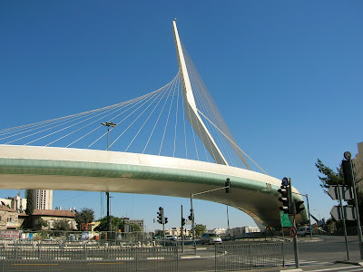
Chords Bridge

Turning Torso

Wish I could of posted my own pictures of these amazing sights for myself - I never get bored of looking at his work. They perform a function; shelter, accommodation or a public use but with an invigorating twist. Any object that combines function with aesthetic appeal ticks my boxes.

Hungry for Raw Storytelling


In all honestly, when I first picked up this DVD from one of the many HMV shelves, I thought this was the directorial debut of Steve 'The Cooler King' McQueen. Rather than being the sadly deceased screen icon of The Great Escape, Hunger was brought to us by a 40 year old Turner Prize winner.

Let's get the trivial information out of the way: Hunger depicts the lives of IRA activists during the 1981 hunger strike in Maze Prison, Northern Ireland. Initially instigated by Bobby Sands / Michael Fassbender (who survived 66 days of the strike), it lasted for seven months and resulted in a further nine men dying for their cause.

To understand this brutal epic you need to understand the director's roots, where he is best known for his work as an accomplished artist. See Deadpan (1997).
The dialogue takes an absence from the majority of the screen-time and replaced by actions that truly speak louder than words (I've put an adequate example below). In fact, the only real dialogue comes in 44minutes after pressing PLAY and stays fixed in a one-shot sequence for 22minutes.


It's strange to watch a movie with no character's opening their mouths, you begin to start interpreting their actions and filling in the blanks, so to speak. Every shot is carefully planned, further evidence that McQueen's previous experiences have helped him here.

This isn't the type of film that you can just sit down and switch off and enjoy (See example above again if unconvinced). You watch brutal scenes based on actual events and, predictably, that's the only way that these can be told with any justice.

One of the most striking images of the entire film has to be the final act where we see a transformed Bobby Sands. At first I believed that there was some kind of digital effect going on to make Fassbender (you might remember him from 300 and Eden Lake - another movie I'll be writing on soon) appear to be not amongst the living. After watching the special features of the disc (a vice that I do alongside listening to directors commentary of the film), I learnt that he was on a diet of 600 caleries per day for three months: that's a handful of nuts, berries and two sardines every day. Very few actors have that degree of commitment so to watch it on the screen made for a chilling viewing.
(Apologies for the theatrics)


It's a must see.

Playing With Type

Nothing beats the feeling of an impulse purchase of a good-looking book. I fell victim recently to Playful Type - a book dedicated to having fun with type. Before coming to Leeds Uni, it never really dawned on me that there's more to typography than just picking a typeface on Illustrator that looked 'nice'. Thankfully I was mistaken.


I realize that this isn't a new and unique idea of carving letters out of apples or what have you but I've gone through this book many, many times and given you a small selection of the best. This was quite difficult because there isn't a minger in the pack; each beautiful in their own way.


Personally, this is the most bewitching type design I have ever seen. It draws me in every time. Made using his own fingerprints, Jonathon Lowman used type to convey an idea of who he is and what type is to him.


I'm going through an experimentation with type at the moment, using fried eggs and piercing the yoke at different angles to create phrases. Should hopefully be posting that up soon.


Buy Playful Type here.
Or if you want to save some pennies then here.

9/28/2009

Da Font-astic Place

Apologies for the title of this blog but hopefully you can understand why this particular website deserves its place as a source of inspiration - DaFont.

For any keen typographer out there, it's a free download website, and one that has helped me a number times over the past few years. It has thousands of specimens to choose from and, more importantly, cheap as chips.

I'll be the first to admit that when I first started this course I didn't care much for typography. I had all the books; I knew all the terminology; but at the end of the day I thought Helvetica would save the day. Thankfully, I'm no longer that naive.

Sites like these are just as important as Dirty Mouse or Made In England; everyday I go online to see how typography is changing and modifying themselves to become more functional and enticing.
As with any creative website, you'll come across some truly diabolical creation but every once in a while, you'll come across a gem.


Hype For Type is another similar website like DaFont but one minor detail: you need to purchase their typefaces. But, and a big one at that, a great deal of them are worth every penny. I'm not ashamed to say that I've bought quite a few from here with the hope of using them on some projects I have in the works at the moment.


Those of you who collect Creative Review might recognize Press Gothic V2 in the September 2009 issue.

9/27/2009

Polaroid: EXP.09.10.09


In 1944, Edwin Land's daughter, whilst on holiday, asked him why she couldn't look at the snaps right away. A few years later, Land commercially unveiled the Land Camera Model 95 and for the next 60 years, became one of the greatest technological inventions.
Using Polaroid's always gave me a better experience than digital cameras ever did. To be able to click the shutter and then 60 seconds later hold your efforts in your hands is a feeling that never becomes novel.


Aim. Click. Capture. Develop. See.
It's an honest way of capturing what's happening, not perfect. The employees of WUCIWUG will no doubt recall the struggle we went through using Polaroids to create something exciting.
Nowadays, anyone can buy a half decent camera for an affordable price, go shooting away on their next holiday and come back with 100s of identical photographs that millions of other tourists have unveiled to their families. They can delete the undesirables and edit their favorites with a black&white effect to make them look chic.


Unfortunately, the Massachusetts-based company announced last year that they were going to cease production of the Polaroid product range.


To commemorate the loss of this instant format, the Atlas Gallery in London will be showcasing the work of the finest photographers who used this technology. There will be work from artists old and new, some you'll know and some you wont. Every photograph is up for grabs - as long as you have up to £8,000 to spare.


The exhibition is open from the 9th October this year. This date is significant because it is the use-by date for the last ever batch of Polaroid films.


May seem quite eager to post a museum event that hasn't been made available to the public yet, or one that opens past this blog deadline; nevertheless, I would never miss this for anything.


Log back on after the 9th to see pictures from this exhibition.

9/22/2009

Job Wouters / Letman


If you've got the February 2009 issue of Creative Review to hand then you'll be able to instantly see an example of his work. After studying typographic design and divulging in graffiti drawings, Letman offers a 'modern spin on the practice of hand-lettering.'


9/13/2009

Life Without Clicking


In a word: astonishing. Stumbled across this website by misspelling a search I was doing for another blog-spot, and I was so happy I did. The premise is pretty self-explanatory. The click is extinct.

My initial experience was difficult to say the least. I began concentrating incredibly hard on not to click (if I was using an actual mouse rather than a mouse pad then I dread to think how much longer it would of taken me to adapt). Soon after, the movements between accessing the different sections of information started to feel more natural. I'm still on the website now just gliding through the website with an unusual satisfaction. Everything from the alluring color palette used to the chosen typeface, all the elements brought together create a stunning website built on a simple idea.

I've only added a few screen shots of my first time using the website because I didn't want to spoil your own experience on it. Enjoy.